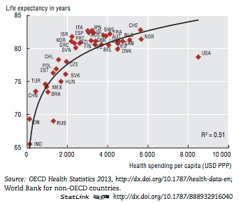
Life Expectancy And Health Care Spending
Looks like this chart is going to be making the rounds. According to this author, a conclusion we can draw from the graph is,
…Why is our system so terrible? Largely because it is built for profit….
In no particular order, here are some comments about the graph and the conclusion:
Note 1: Starting the Y axis on a graph at a value other than 0 is visually misleading. This is a form of chartsmanship. In this case, it exaggerates the differences among life expectancies.
Note 2: Expensive R&D happens mainly in the US (at least until Obamacare takes its toll). Just about every other country on the chart free-rides off of American innovation.
Note 3: I notice that RUS is another outlier – lying off the curve in the same direction as the US. Is the problem there that their system is “built for profit”, too?
Note 4: The two systems in the US with costs growing far ahead of inflation are health care and education. It may not be a coincidence that these are also the fields where the government meddles the most.
Note 5: Excluding Russia and China, the more appropriate comparison for most of these countries would be American states. Most of the countries on the chart are tiny in comparison to the US. The US is outperforming both Russia and China, and I’d be willing to bet that we would find a number of American states that outperform the smaller countries on the curve.
Note 6: Genetics and life-style choices also play a role in life expectancy. These are not accounted for in the chart or the article.
Note 7: According to Preston and Ho (2009),
The question that we have posed is much simpler: does a poor performance by the US health care system account for the low international ranking of longevity in the US? Our answer is, “no”.
Note 8: Forbes points out that,
U.S. life-expectancy statistics are skewed by the fact that the U.S. doesn’t have one health-care system, but three: Medicaid, Medicare, and private insurance. (A fourth, the Obamacare exchanges, is supposed to go into effect in 2014.)…
…To my knowledge, no one has attempted to segregate U.S. life-expectancy figures by insurance status. But based on the data we have, it’s highly likely that those on private insurance have the best life expectancy, with Medicare patients in the middle, and the uninsured and Medicaid at the bottom.
Note 9: Gapminder shows us that 1.) The US is fairly low in terms of out of pocket expense. In terms of life expectancy, the US actually shows among the highest returns on investment when graphed against out of pocket expenses; -and- 2.) There may be a relationship between out of pocket expense and total health care cost. It appears that lower out of pocket costs correlate with higher total costs. This lends credence to the idea that our health care costs are so high due to third party payers.

Bottom Line: Obviously, I’d like to see lower costs and longer life expectancies, but this author provides no data to support his claim that deficiency can be blamed on “profit” and this chart doesn’t provide enough data for meaningful comparison.
This post was published first at the Pennsylvania Tenth Amendment Center.
- Action Alert: NDAA Non-Compliance Bill, SB999, Needs Support in the PA Senate - January 13, 2014
- Does US Life Expectancy Data Discredit For-Profit Health Care? - December 9, 2013
- A Retrospective View of Articles from the PA Tenth Amendment Center - December 2, 2013
